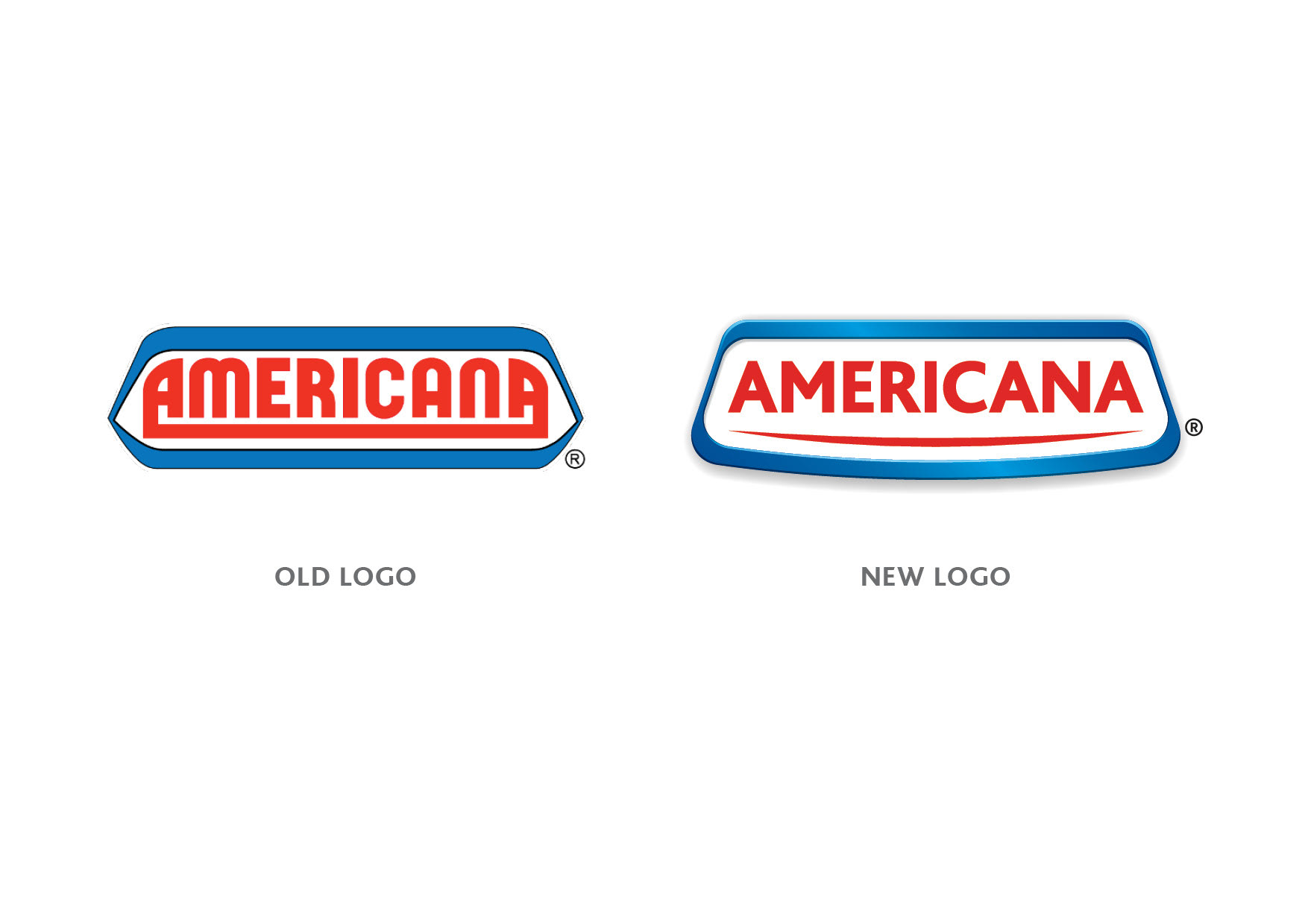

The Americana Group, a successful organization in the Middle East, has decided to upgrade its visual identity, which was established in 1970 and has remained unchanged since. The group, renowned as one of the largest food manufacturing and distribution companies in the region, originated in Kuwait and pioneered the concept of quick-service restaurants in the local market.
The decision to revamp the company's identity was driven by the need to align with the evolving visual standards of other major F&B companies over the years. However, it was equally important to preserve and leverage the brand's equity, heritage, and nostalgic charm embodied by the old logo. The aim is to infuse the identity with a fresh, contemporary look that elicits positive emotions and fosters a welcoming atmosphere.